Carrier Case Analytics
Wallet Share Module
This module allows you to
- Identify growth opportunities by targeting the best performing agencies and agents that will help you achieve success
- Compare your performance (cycle time, placement ratio) vs other carriers in our customer benchmark
- Measure the impact of a new product launch or marketing campaign by looking at your wallet share over time
Filters & Benchmark Criteria
Filtering the Dashboard
Benchmark Criteria
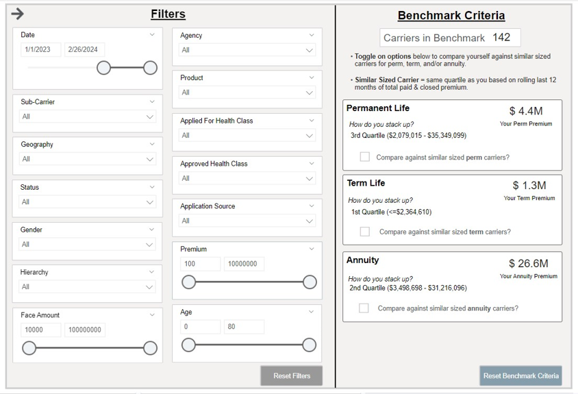
This displays the number of carriers in iPipeline’s network (12-month carriers who do business with the 300+ agencies leveraging the iPipeline Agency Integrator platform. For agencies leveraging Agency Integrator, 100% of their business flows through iPipeline). iPipeline sorts all the carriers in this pool by their total paid premium over a rolling 12-month period and breaks the list into 4 quartiles (even segments).
For example, if there are 100 carriers in the total benchmark, the 1st quartile would be the 25 carriers with the lowest total paid premium over the last 12 months. The 4th quartile would be the 25 carriers with the highest total paid premium. This analysis is completed independently, for both term, permanent and annuity business.
Wallet Share Analysis

Overview
This dashboard displays your wallet share performance across various metrics including trends, product, face amount bands, age groups, and applied/approved health classes compared to the prior year. The total number of carriers in this benchmark is displayed at the top of the dashboard. As you filter, this number will dynamically update, along with the rest of the dashboard.
Change the View Wallet Share By filter on the dashboard to see wallet share by paid premium, paid cases, submitted premium, or submitted cases.
Click the Overall, Distributor, Agent, or Impact Analysis tabs in the top left, directly on the dashboard, to see various wallet share metrics. By default the dashboard is set to the Overall tab.
Annualized Commissionable Premium
Note, sources of premium in this module are mostly from agency manual entry on the cases. The other sources could be from the pending case feeds from carriers and/or API connections that an agency leverages such as iGO or other eApplication Integrations to feed premiums. In addition, rider premium is not included in the annualized commissionable premium calculation at this time and rider renewals are not tracked in iPipeline’s Agency Integrator platform, so will not be reflected in the premium totals in this module.
Data Definitions
Wallet Share = number of your organization cases or premium divided by the total cases or premium in the benchmark.
*Note, paid cases & premium is based on paid date while submitted cases & premium is based on carrier submitted date.
Benchmark = the other carriers you’re being compared to (selected in the filter panel on the Benchmark Criteria section).
Placement Ratio = paid cases / (paid cases + closed cases).
Cycle Time = the number of days from Submission date to Policy Issue date.
Better Than Applied For Rate = the number of cases where the approved risk class is better than the applied risk class divided by all cases excluding Unknowns.
Worse Than Applied For Rate = the number of cases where the approved risk class is worse than the applied risk class divided by all cases excluding Unknowns.
Approved As Applied For Rate = the number of cases where the approved risk class is the same as the applied risk class divided by all cases excluding Unknowns.
Prior Year = the same time period selected in the date filter, but back 1 year.
Applied For Types with Risk Classes
Using the scoring below here are examples of how the applied for types are being handled
- Applied Preferred Tobacco & Approved Standard Plus Non-Tobacco =Approved Worse Than Applied For.
Another example
- Applied Standard Non-Tobacco & Approved Standard Non-Tobacco = Approved As Applied For.
Lastly,
- Applied Preferred Non-Tobacco & Approved Preferred Best Non-Tobacco = Approved Better Than Applied For.
Risk Class Scoring (Lower is Better):
- Preferred Best Non-Tobacco = 100
- Preferred Non-Tobacco = 200
- Preferred Tobacco = 300
- Standard Plus Non-Tobacco = 400
- Standard Non-Tobacco = 500
- Standard Tobacco = 600
- Not Applicable = N/A
- Unknown = N/A
Filtering the Dashboard
Choose the Filter icon in the top right of the dashboard to narrow down by sub-carrier, product, premium, face amount, health class, and more.
Note, some cases with premiums or face amounts outside of realistic bounds had their premiums dropped during cleaning to not skew averages. These cases are not shown by default. To see these cases, adjust the minimum of the premium and face amount sliders to include 0.
Impact Analysis Drilldown
Right click any visual and select “Drill through > Drill – Impact Analysis” to get more information on what key metrics are impacting wallet share.
Fastest Changing Metrics Drilldown
Right click any point on the trend lines and select “Drill through > FCM Drill through” to get details behind what changed most in your organization versus the prior period.
For example, if you’re looking at a monthly view and drill into submitted cases for February 2024, it would be the change in submitted cases from January 2024 to February This view also shows how your change compared to that of the other carriers in the benchmark.
Exporting Data
Click the “Quick Actions” dropdown in the top right of your screen to send this information to your email. Choosing “Export” will immediately send an email with a file attachment. This email is tied to your InsureSight username.
Choosing “Schedule” will allow you to set up a recurring email to be delivered on the schedule you choose. To modify this schedule, click the “Settings” option in the far-left navigation menu under “InsureSight.”
Agency Prospecting
Overview
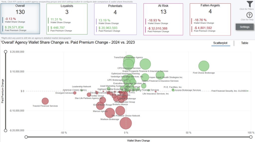
This dashboard displays your change in wallet share by agency comparing time periods you select in the settings page (click settings button in top right corner to modify date comparison and adjust wallet share thresholds of individual agency prospecting groups). The prospecting dashboards are always comparing period over period performance.
By default, you are on the overall analysis tab which displays all your agency changes in wallet share & paid premium. Click KPI cards at the top of dashboard to analyze specific prospecting group performance including Overall, Loyalists, Potentials, At Risk, & Fallen Angels.
The bubbles on the scatterplot are sized based on total paid premium change. Click scatterplot or table tabs on the top right corner of visual to switch visual format.
*Note, some agencies may have an increase in wallet share but decrease in paid premium which is showing that agency may not be producing as much premium as the previous period, however, you are still penetrating more of their overall total business.
Settings Tab
Navigate to the settings page by clicking the settings button below the help layer button. All user configurable options are noted with the following icon 🛈.
*Note, any selections made on the settings page will carry over to the Agency Prospecting dashboard.
Annualized Commissionable Premium
Note, sources of premium in this module are mostly from agency manual entry on the cases. The other sources could be from the pending case feeds from carriers and/or API
connections that an agency leverages such as iGO or other eApplication Integrations to feed premiums.
In addition, rider premium is not included in the annualized commissionable premium calculation at this time and rider renewals are not tracked in iPipeline’s Agency
Integrator platform, so will not be reflected in the premium totals in this module.
Data Definitions
- Paid Premium Wallet Share = your organization total paid premium divided by total paid premium in the benchmark. Note, paid premium is based on paid date.
- Period Over Period = the prior period (i.e. one period back). For example, if you choose Q2 2024, you’re comparing Q2 2024 to Q1 2024 (one quarter back). If you choose March 2024, you’re comparing to February 2024 (one month back).
- Benchmark = the other carriers you’re being compared to (selected in the filter panel on the Benchmark Criteria section).
- Placement Ratio = paid cases / (paid cases + closed cases).
- Cycle Time = the number of days from Submission date to Policy Issue date.
- Better Than Applied For Rate = the number of cases where the approved risk class is better than the applied risk class divided by all cases excluding Unknowns.
- Worse Than Applied For Rate = the number of cases where the approved risk class is worse than the applied risk class divided by all cases excluding Unknowns.
- Approved As Applied For Rate = the number of cases where the approved risk class is the same as the applied risk class divided by all cases excluding Unknowns.
Agency Prospecting Groups
- Overall = all agencies that do business with you.
- Loyalists = agencies that give you most of their business.
- Potentials = agencies that are growing quickly with you and ones you should double down on.
- At Risk = agencies that used to bring you a lot of business, but their wallet share has been decreasing with you.
- Fallen Angels = agencies that stopped doing business with you but were good and you’d want back.
Filtering the Dashboard
Choose the Filter icon in the top right of the dashboard to narrow down by sub-carrier, product, premium, face amount, health class, and more.
*Note, some cases with premiums or face amounts outside of realistic bounds had their premiums dropped during cleaning to not skew averages. These cases are not shown by default. To see these cases, adjust the minimum of the premium and face amount sliders to include 0.
Prospecting Paid Premium Analysis Drilldown
Right click any datapoint and select “Drill through > Drill – Prospecting Paid Premium Analysis” to get more information on what key dimensions such as agent, product, face amount, age group, and applied for underwriting types are impacting wallet share & paid premium changes.
Exporting Data
Click the “Quick Actions” dropdown in the top right of your screen to send this information to your email. Choosing “Export” will immediately send an email with a file attachment. This email is tied to your InsureSight username.
Choosing “Schedule” will allow you to set up a recurring email to be delivered on the schedule you choose. To modify this schedule, click the “Settings” option in the far-left navigation menu under “InsureSight.”
Agency Prospecting – Settings

Settings Tab
Navigate to the settings page by clicking the settings button below the help layer button. All user configurable options are noted with the following icon 🛈.
*Note, any selections made on the settings page will carry over to the Agency Prospecting dashboard. To navigate back to the full analysis, click the back arrow in the top left corner.
Selecting Your Period for Comparison
On the settings page, select the time period you want to compare in the bottom left of the screen. You can choose a year, quarter, month, or week (expand the selections for more options). Once selected, you’ll see the selected date comparison card above the date filter on the dashboard (always comparing period over period).
Period Over Period = the prior period (i.e. one period back). For example, if you choose Q3 2024, you’re comparing Q3 2024 to Q2 2024 (one quarter back). If you choose September 2024, you’re comparing to August 2024 (one month back).
Configure Thresholds for Agency Prospecting Groups
On the settings page, each prospect group is on a separate card with ability to adjust range thresholds of wallet share. Above each slider is natural language text to explain what this group is looking at based on your ranges.
For example, the default for Loyalists is 25% for both time periods. This means agencies that are giving you greater than or equal to 25% of their total wallet share for that time period are also giving you 25% of their total wallet share for the previous period. The output section of the card spits out the natural language of the entire loyalist analysis including how much they changed in wallet share & paid premium overall.
Agency Prospecting Groups
- Overall = all agencies that do business with you.
- Loyalists = agencies that give you most of their business.
- Potentials = agencies that are growing quickly with you and ones you should double down on.
- At Risk = agencies that used to bring you a lot of business, but their wallet share has been decreasing with you.
- Fallen Angels = agencies that stopped doing business with you but were good and you’d want back.
Agency Scorecard
Dashboard Overview
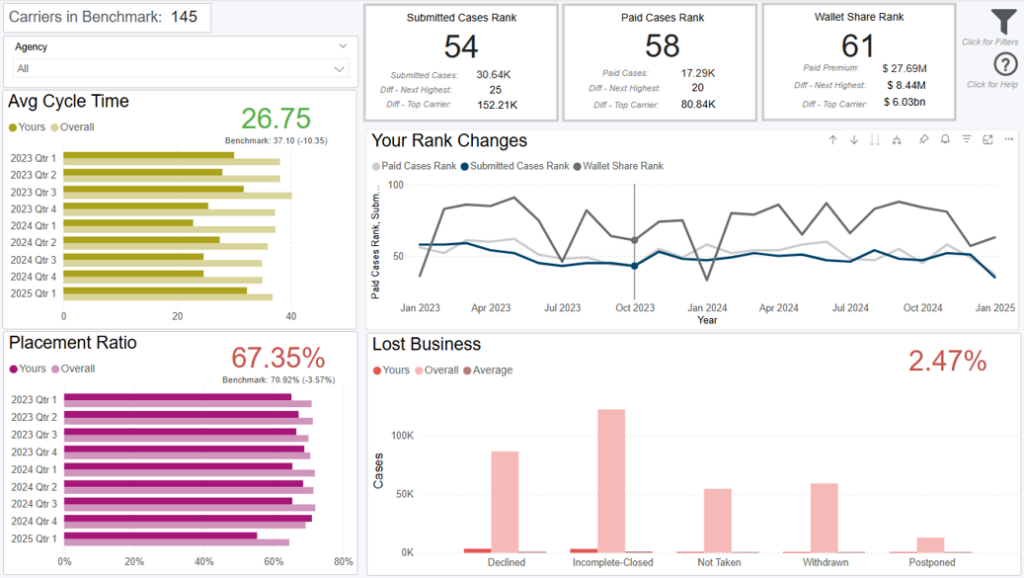
This scorecard shows premium and operational analytics for a single or multiple distributors that work with you, compared to their performance with the other carriers they work with. To view this scorecard for a specific agent, choose them from the Distributor dropdown in the top left of the dashboard.
Annualized Commissionable Premium
*Note, sources of premium in this module are mostly from agency manual entry on the cases. The other sources could be from the pending case feeds from carriers and/or API connections that an agency leverages such as iGO or other eApplication Integrations to feed premiums.
In addition, rider premium is not included in the annualized commissionable premium calculation at this time and rider renewals are not tracked in iPipeline’s Agency Integrator platform, so will not be reflected in the premium totals in this module.
Data Definitions
- % of Total = the agent’s total with your organization / their total across all other carriers they work with
- Placement Ratio = paid cases / (paid cases + closed cases)
- Cycle Time = the number of days from Submission date to Policy Issue date
- Yours = the distributor’s performance with your organization
- Overall = the distributor’s average performance with all other carriers they work with
- Benchmark = the other carriers you’re being compared to (selected in the filter panel on the Benchmark Criteria section).
Filtering the Dashboard
Choose the Filter icon in the top right of the dashboard to narrow down by sub-carrier, product, premium, face amount, health class, and more.
Note, some cases with premiums or face amounts outside of realistic bounds had their premiums dropped during cleaning to not skew averages. These cases are not shown by default. To see these cases, adjust the minimum of the premium and face amount sliders to include 0.
Exporting Data
Click the “Quick Actions” dropdown in the top right of your screen to send this information to your email. Choosing “Export” will immediately send an email with a file attachment. This email is tied to your InsureSight username.
Choosing “Schedule” will allow you to set up a recurring email to be delivered on the schedule you choose. To modify this schedule, click the “Settings” option in the far-left navigation menu under “InsureSight.”
Agency Total Visibility

Overview
This dashboard provides visibility into 100% of an agency’s paid & submitted business percentages across key dimensions such as hierarchy, product, face amount bands, age groups, and premium bands.
*Note, your organization’s percentage of total business plus the benchmark’s percentage of total business equals 100% of an agency’s paid or submitted business for each key dimension.
The total number of carriers in this benchmark is displayed at the top of the dashboard. As you filter, this number will dynamically update, along with the rest of the dashboard.
Annualized Commissionable Premium
*Note, sources of premium in this module are mostly from agency manual entry on the cases. The other sources could be from the pending case feeds from carriers and/or API connections that an agency leverages such as iGO or other eApplication Integrations to feed premiums. In addition, rider premium is not included in the annualized commissionable premium calculation at this time and rider renewals are not tracked in iPipeline’s Agency Integrator platform, so will not be reflected in the premium totals in this module.
Data Definitions
- % of Total Business = out of all cases or premium an agency does across the entire benchmark, what % of the total is distributed into each key dimension such as hierarchy, product, age group, face amount, or premium band. The dimensions you see are not limited to what your organization does business in, meaning you are seeing total visibility of the selected agency’s paid & submitted percentages.
*Note, the benchmark % of total business is not including your organization’s % of total business, this is so you can see your own % of total business at an agency separate from the benchmark. If you add the benchmark % of total business plus your organization’s % of total business, this equals 100% of an agency’s total.
- Wallet Share = number of your organization cases or premium divided by the total cases or premium in the benchmark.
*Note, paid cases & premium is based on paid date while submitted cases & premium is based on carrier submitted date.
- Benchmark = the other carriers you’re being compared to (selected in the filter panel on the Benchmark Criteria section).
Filtering the Dashboard
Choose the Filter icon in the top right of the dashboard to narrow down by sub-carrier, product, premium, face amount, health class, and more.
*Note, some cases with premiums or face amounts outside of realistic bounds had their premiums dropped during cleaning to not skew averages. These cases are not shown by default. To see these cases, adjust the minimum of the premium and face amount sliders to include 0.
Exporting Data
Click the “Quick Actions” dropdown in the top right of your screen to send this information to your email. Choosing “Export” will immediately send an email with a file attachment. This email is tied to your InsureSight username.
Choosing “Schedule” will allow you to set up a recurring email to be delivered on the schedule you choose. To modify this schedule, click the “Settings” option in the far-left navigation menu under “InsureSight.”
Active Agency List
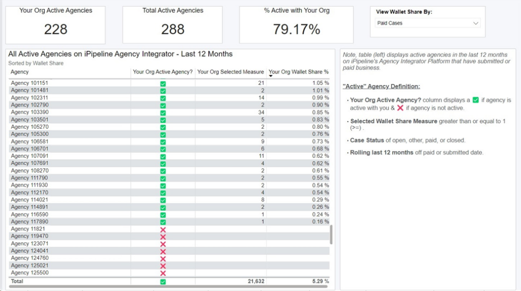
*Note, the table (left) displays active agencies in the last 12 months on iPipeline’s Agency Integrator Platform that have submitted or paid business.
“Active” Agency Definition:
- Your Org Active Agency? column displays a ✅ if agency is active with you & ❌ if agency is not active.
- Selected Wallet Share Measure greater than or equal to 1 (>=) .
- Case Status of open, other, paid, or closed.
- Rolling last 12 months off paid or submitted date.
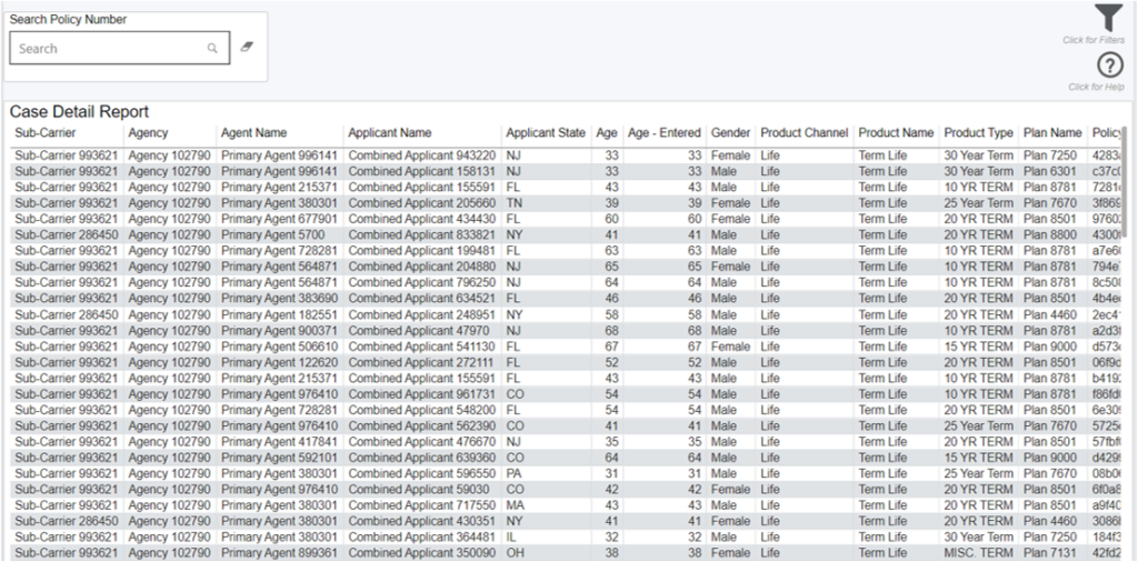
Case Detail Report 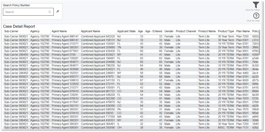
Annualized Commissionable Premium
*Note, sources of premium in this module are mostly from agency manual entry on the cases. The other sources could be from the pending case feeds from carriers and/or API connections that an agency leverages such as iGO or other eApplication Integrations to feed premiums. In addition, rider premium is not included in the annualized commissionable premium calculation at this time and rider renewals are not tracked in iPipeline’s Agency Integrator platform, so will not be reflected in the premium totals in this module.
Data Definitions
- Carrier Cycle time = Carrier cycle time greater than or equal to 0 and less than or equal to 200
- Distributor Cycle time = Distributor cycle time greater than or equal to 0 and less than or equal to 200
- Face Amount = face amount greater than or equal to $10,000 and less than or equal to $100,000,000
- Premium = base premium greater than or equal to $100 and less than or equal to $10,000,000
- Age = issue age greater than or equal to 0 and less than or equal to 80
- Entered Fields = distributor entered values for cycle time, face amount, premium, and age
- Count of APSs Ordered = number of APSs that were ordered on a single case
- Count of Parameds Ordered = number of Parameds that were ordered on a single case
Exporting Data
Click the “Quick Actions” dropdown in the top right of your screen to send this information to your email. Choosing “Export” will immediately send an email with a file attachment. This email is tied to your InsureSight username.
Choosing “Schedule” will allow you to set up a recurring email to be delivered on the schedule you choose. To modify this schedule, click the “Settings” option in the far-left navigation menu under “InsureSight.”
Operational Module
This module allows you to
- Examine your performance over time and compare it to our customer benchmark
- Analyze your lost business for areas of improvement and see how you compare to our customer benchmark
- Identify the factors that caused your business to increase/decrease the most for possible follow up
Benchmark Criteria
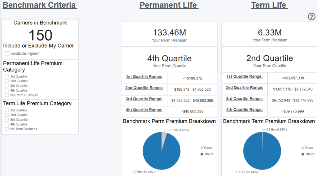
Overview
This dashboard displays the number of carriers in iPipeline’s network (12-month carriers who do business with the 300+ agencies leveraging the iPipeline Agency Integrator platform. For agencies leveraging Agency Integrator, 100% of their business flows through iPipeline). iPipeline sorts all the carriers in this pool by their total paid premium over a rolling 12-month period and breaks the list into 4 quartiles (even segments).
For example, if there are 100 carriers in the total benchmark, the 1st quartile would be the 25 carriers with the lowest total paid premium over the last 12 months. The 4th quartile would be the 25 carriers with the highest total paid premium. This analysis is completed independently, for both term and permanent business.
Filters

Filtering the Dashboard
Operational Trends

Overview
This dashboard displays how your total performance in average face amount, average premium, average cycle time, and placement ratio compares to the other carriers you’ve chosen as the benchmark from the Benchmark Criteria dashboard. The total number of carriers in this benchmark is displayed at the top of the dashboard. As you filter, this number will dynamically update, along with the rest of the dashboard.
*Note: These are only carriers with paid or closed business, so the number may be slightly different than shown on the Benchmark Criteria dashboard, which looks at all business regardless of case status.
The trend lines show how your performance across these four measures compares to the trend of other carriers. You can change the time dimension (i.e. x axis) by selecting the “Week,” “Month,” “Quarter,” “Year” buttons in the top left.
*Note: The benchmark line is the average of all other carriers.
Data Definitions
Benchmark = the other carriers you’re being compared to (selected on the Benchmark Criteria dashboard)
Carrier Cycle Time = the number of days from Submission date to Policy Issue date
BGA Cycle Time = the number of days from the BGA Create Date to the Paid/Closed date
Placement Ratio = paid cases / (paid cases + closed cases)
Filtering the Dashboard
Choose the Filter icon in the top right of the dashboard to narrow down by sub-carrier, product, premium, face amount, health class, and more. Note: At least 4 distributors must be chosen from the Distributor filter to protect our customers’ data. If fewer than 4 distributors are selected, an alert layer will display asking you to broaden your search. The alert layer will also display if the number of carriers in the benchmark is fewer than 4. Some cases with premiums or face amounts outside of realistic bounds had their premiums dropped during cleaning to not skew averages. These cases are not shown by default. To see these cases, adjust the minimum of the premium and face amount sliders to include 0.
Case Details Drilldown
Right click any point on the trend lines and select “Drill through > Drill Case Details” to get your underlying case details.
Fastest Changing Metrics Drilldown
Right click any point on the trend lines and select “Drill through > FCM Drill through” to get details behind what changed most in your organization versus the prior period. For example, if you’re looking at a monthly view and drill into submitted cases for February 2024, it would be the change in submitted cases from January 2024 to February 2024. This view also shows how your change compared to that of the other carriers in the benchmark.
Exporting Data
Click the “Quick Actions” dropdown in the top right of your screen to send this information to your email. Choosing “Export” will immediately send an email with a file attachment. This email is tied to your InsureSight username.
Choosing “Schedule” will allow you to set up a recurring email to be delivered on the schedule you choose. To modify this schedule, click the “Settings” option in the far-left navigation menu under “InsureSight.”
Lost Business
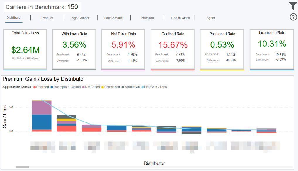
Overview
This dashboard displays your rate of lost business across five closed business statuses and compares you to the other carriers you’ve chosen as the benchmark from the Benchmark Criteria dashboard. The total number of carriers in the benchmark is displayed at the top of the dashboard. As you filter, this number will dynamically update, along with the rest of the dashboard.
*Note: These are only carriers with paid or closed business, so the number may be slightly different than shown on the Benchmark Criteria dashboard, which looks at all business regardless of case status.
Data Definitions
Rate = your cases in that status / all your paid and closed cases
Benchmark = cases in that status for all carriers in the benchmark / all paid and closed cases for all carriers in the benchmark
Difference = Your Rate – Benchmark Rate
Net Gain/Loss = Case Gain or Loss due to Rate Difference * Your Avg Premium
The Net Gain/Loss is represented in total for the 5 lost business statuses on the top left card. It is also represented by the line on the bar chart, indicating Distributors, Products…etc. where you had the most gain or loss, compared to the other carriers in the benchmark.
Example
Your organization has a withdrawn rate of 12%, and the benchmark is 10%. You have 2% more withdrawn business than the benchmark. How many cases this accounted for, multiplied by your average premium per case, gets factored into the Total Gain/Loss card.
Where this increased declined rate occurred vs other carriers (i.e. the delta) is shown on the bar chart. The buttons at the top of the dashboard show this delta distribution by Distributor, Product, Agent, and more so you can identify problem areas.
Filtering the Dashboard
Choose the Filter icon in the top right of the dashboard to narrow down by sub-carrier, product, premium, face amount, health class, and more.
Some cases with premiums or face amounts outside of realistic bounds had their premiums dropped during cleaning to not skew averages. These cases are not shown by default. To see these cases, adjust the minimum of the premium and face amount sliders to include 0.
Case Details Drilldown
Right click any point on the trend lines and select “Drill through > Drill Case Details” to get your underlying case details.
Exporting Data
Click the “Quick Actions” dropdown in the top right of your screen to send this information to your email. Choosing “Export” will immediately send an email with a file attachment. This email is tied to your InsureSight username.
Choosing “Schedule” will allow you to set up a recurring email to be delivered on the schedule you choose. To modify this schedule, click the “Settings” option in the far-left navigation menu under “InsureSight.”
Lost Business Trends

Overview
This dashboard displays how your performance in placement ratio, as well as rates of declined, not taken, and postponed cases compares over time to the other carriers you’ve chosen as the benchmark from the Benchmark Criteria dashboard. The total number of carriers in this benchmark is displayed at the top of the dashboard. As you filter, this number will dynamically update, along with the rest of the dashboard.
Note: These are only carriers with paid or closed business, so the number may be slightly different than shown on the Benchmark Criteria dashboard, which looks at all business regardless of case status.
The trend lines show how your performance across these four measures compares to the trend of other carriers. You can change the time dimension (i.e. x axis) by selecting the “Week,” “Month,” “Quarter,” “Year” buttons in the top left.
*Note: The benchmark line is the average of all other carriers for placement ratio, and the total of other carriers for case numbers.
Data Definitions
Benchmark = the other carriers you’re being compared to (selected on the Benchmark Criteria dashboard)
Placement Ratio = paid cases / (paid cases + closed cases)
Filtering the Dashboard
Choose the Filter icon in the top right of the dashboard to narrow down by sub-carrier, product, premium, face amount, health class, and more. Note: At least 4 carriers and 4 distributors must be chosen from the benchmark to show all data on this page. This is in order to protect our customers’ data. If some measures are hidden, choose less restrictive filters and they will reappear.
Some cases with premiums or face amounts outside of realistic bounds had their premiums dropped during cleaning to not skew averages. These cases are not shown by default. To see these cases, adjust the minimum of the premium and face amount sliders to include 0.
Case Details Drilldown
Right click any point on the trend lines and select “Drill through > Drill Case Details” to get your underlying case details.
Fastest Changing Metrics Drilldown
Right click any point on the placement ratio trend line and select “Drill through > FCM Drill through” to get details behind what changed most in your organization versus the prior period. For example, if you’re looking at a monthly view and drill into placement ratio for February 2024, it would be the change in placement ratio from January 2024 to February 2024. This view also shows how your change compared to that of the other carriers in the benchmark.
Exporting Data
Click the “Quick Actions” dropdown in the top right of your screen to send this information to your email. Choosing “Export” will immediately send an email with a file attachment. This email is tied to your InsureSight username.
Choosing “Schedule” will allow you to set up a recurring email to be delivered on the schedule you choose. To modify this schedule, click the “Settings” option in the far-left navigation menu under “InsureSight.”
Rank Changes

Overview
This dashboard displays where you rank compared to the other carriers you’ve chosen as the benchmark from the Benchmark Criteria dashboard, across multiple measures such as wallet share and placement ratio. The cards at the top of the dashboard display your overall rank for the time period selected, while the line chart shows how each of these ranks changed over time. The right y-axis indicates rank changes and you can click the “Week” “Month” “Quarter” “Year” buttons at the top of the dashboard to analyze these rank changes more granularly. A rank of “1” would be the best.
Data Definitions
Carriers in Benchmark = the other carriers you’re being compared to (selected on the Benchmark Criteria dashboard)
Wallet Share = your total paid premium / the sum of paid premium for carriers in the benchmark
Placement Ratio = paid cases / (paid cases + closed cases)
Cycle Time = the number of days from Submission date to Policy Issue date
Wallet Share Example
The red and green bars on the chart indicate how much premium you gained or lost due to your changes in wallet share rank. For example, if you ranked 10 out of 20 in January 2024, and then 12 out of 20 in February 2024, you went down 2 ranks (i.e. two carriers did better than you in February vs January).
This dashboard quantifies that wallet share loss from January to February and displays it as a red bar that corresponds with the Gain/Loss left y-axis. The “Wallet Share Change Gain/Loss” card in the top left displays the net gain/loss across the entire time period selected.
Filtering the Dashboard
Choose the Filter icon in the top right of the dashboard to narrow down by sub-carrier, distributor, product, premium, face amount, and more. An alert layer will also display if the number of carriers in the benchmark is fewer than 4.
Some cases with premiums or face amounts outside of realistic bounds had their premiums dropped during cleaning to not skew averages. These cases are not shown by default. To see these cases, adjust the minimum of the premium and face amount sliders to include 0.
Case Details Drilldown
Right click any point on the trend lines and select “Drill through > Drill Case Details” to get your underlying case details.
Fastest Changing Metrics Drilldown
Right click any point on the trend lines and select “Drill through > FCM Drill through” to get details behind what changed most in your organization versus the period before. For example, if you’re looking at a monthly view and drill into your submitted cases rank for February 2024, it would be the change in submitted cases from January 2024 to February 2024. This view also shows how your change compared to that of the other carriers in the benchmark.
Exporting Data
Click the “Quick Actions” dropdown in the top right of your screen to send this information to your email. Choosing “Export” will immediately send an email with a file attachment. This email is tied to your InsureSight username.
Choosing “Schedule” will allow you to set up a recurring email to be delivered on the schedule you choose. To modify this schedule, click the “Settings” option in the far-left navigation menu under “InsureSight.”
Fastest Changing Metrics
Overview
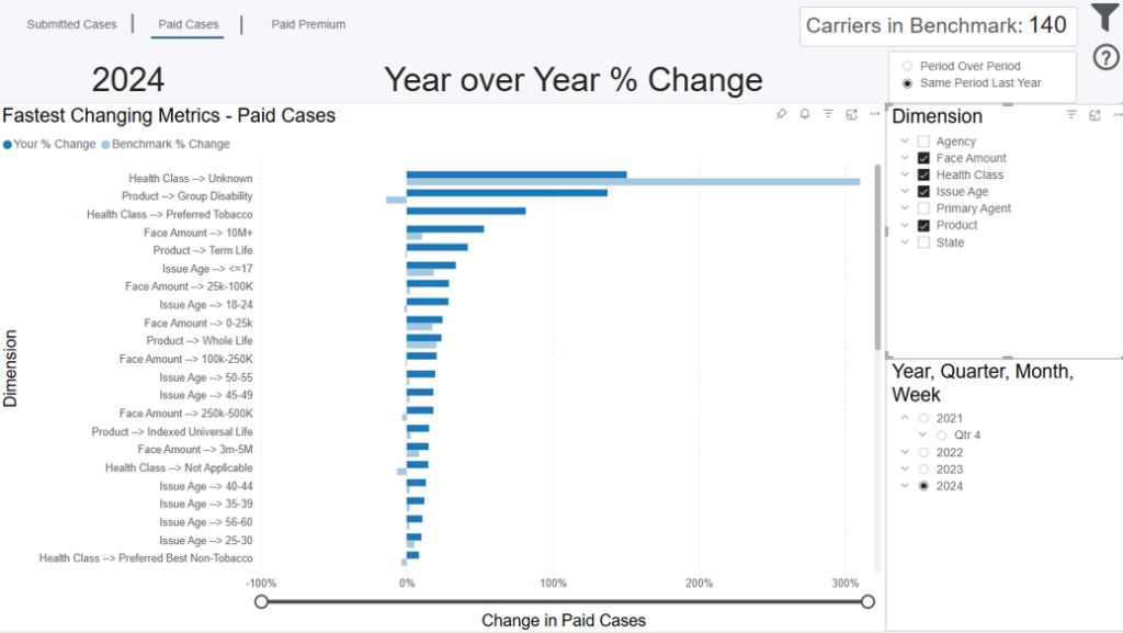
This dashboard displays the biggest changes in your organization from one time period to another and compares them to the average change across the other carriers you’ve chosen as the benchmark from the Benchmark Criteria dashboard. To provide the most flexible insights, this dashboard allows you to dynamically select which time period, measure, and dimension(s) you want to compare. The dark blue bar represents your percentage change for the selected time period and measure. The y axis shows this percentage change across your selected dimension(s).
Selecting Your Time Period for Comparison
Select the time period you want to compare in the bottom right of the screen. You can choose a year, quarter, month, or week (expand the selections for more options). Once selected, the comparison is always the prior period (i.e. one period back). For example, if you choose Q2 2024, you’re comparing Q2 2024 to Q1 2024 (one quarter back). If you choose March 2024, you’re comparing to February 2024 (one month back).
Selecting Your Measure for Comparison
The dark blue bar will show the percentage change for the time period comparison for either submitted cases, paid cases, or paid premium. You can toggle among these options by clicking the “Submitted Cases,” “Paid Cases,” and “Paid Premium” buttons in the top left of the screen.
Selecting Your Dimensions for Comparison
Lastly, choose the dimensions you want to see this percentage change for. You can choose to show all on the chart (displayed on the y axis), or a sub-set by checking the Dimension options to the right of the dashboard.
Example
If you select Q2 2024 as your period, “Submitted Cases” as your measure, and “Product” as your dimension, the bar chart will show your biggest changes in submitted cases from Q1 2024 to Q2 2024 across all your products – represented by the dark blue bar.
By comparison, you’ll also see the average change in submitted cases over that time period, for those products, for the other carriers you’re being benchmarked against – represented by the light blue bar.
Note: For dimensions where there is a benchmark bar, but not one for your organization, this means your organization does not sell that product…etc.
Filtering the Dashboard
Choose the Filter icon in the top right of the dashboard to narrow down by sub-carrier, distributor, product, premium, face amount, gender, age, and more. Note: An alert layer will display if the number of carriers in the benchmark is fewer than 4.
Some cases with premiums or face amounts outside of realistic bounds had their premiums dropped during cleaning to not skew averages. These cases are not shown by default. To see these cases, adjust the minimum of the premium and face amount sliders to include 0.
Exporting Data
Click the “Quick Actions” dropdown in the top right of your screen to send this information to your email. Choosing “Export” will immediately send an email with a file attachment. This email is tied to your InsureSight username.
Choosing “Schedule” will allow you to set up a recurring email to be delivered on the schedule you choose. To modify this schedule, click the “Settings” option in the far-left navigation menu under “InsureSight.”
Premium Forecasting
Overview
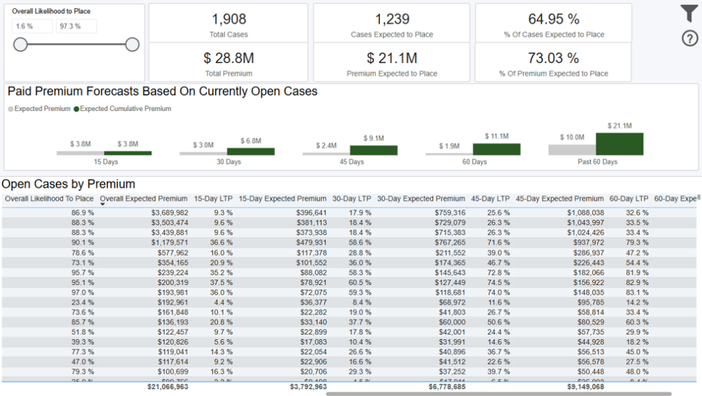
This dashboard displays a forecast based on all open formal cases showing their overall likelihood to place and probability of placing within 15, 30, 45, 60, and beyond 60 days.
The forecast can be adjusted with the ‘Overall Likelihood to Place’ slider on screen which allows you to see a more conservative or aggressive outlook on placement.
The “Open Cases by Premium” table displays your underlying case details sorted by premium.
Data Definitions
Past 60 Days = beyond sixty days from today (excluding day sixty)
Filtering the Dashboard
Choose the Filter icon in the top right of the dashboard to narrow down by distributor, product, health class, agent, and more. Any selections from this filter pane will dynamically update all visuals on the dashboard.
Note: The date filter uses Paid, Closed, or Created date. However, when submitted cases and/or submitted premium are used it goes off of submitted date.
Exporting Data
Click the “Quick Actions” dropdown in the top right of your screen to send this information to your email. Choosing “Export” will immediately send an email with a file attachment. This email is tied to your InsureSight username.
Choosing “Schedule” will allow you to set up a recurring email to be delivered on the schedule you choose. To modify this schedule, click the “Settings” option in the far-left navigation menu under “InsureSight”.
Case Detail Report

Annualized Commissionable Premium
Note, sources of premium in this module are mostly from agency manual entry on the cases. The other sources could be from the pending case feeds from carriers and/or API connections that an agency leverages such as iGO or other eApplication Integrations to feed premiums. In addition, rider premium is not included in the annualized commissionable premium calculation at this time and rider renewals are not tracked in iPipeline’s Agency Integrator platform, so will not be reflected in the premium totals in this module.
Data Definitions
Carrier Cycle time = Carrier cycle time greater than or equal to 0 and less than or equal to 200
Distributor Cycle time = Distributor cycle time greater than or equal to 0 and less than or equal to 200
Face Amount = face amount greater than or equal to $10,000 and less than or equal to $100,000,000
Premium = base premium greater than or equal to $100 and less than or equal to $10,000,000
Age = issue age greater than or equal to 0 and less than or equal to 80
Entered Fields = distributor entered values for cycle time, face amount, premium, and age
Count of APSs Ordered = number of APSs that were ordered on a single case
Count of Parameds Ordered = number of Parameds that were ordered on a single case
Exporting Data
Click the “Quick Actions” dropdown in the top right of your screen to send this information to your email. Choosing “Export” will immediately send an email with a file
attachment. This email is tied to your InsureSight username.
Choosing “Schedule” will allow you to set up a recurring email to be delivered on the schedule you choose. To modify this schedule, click the “Settings” option in
the far-left navigation menu under “InsureSight.”
Decisioning Module
This module allows you to
- Identify how risk class, ordered APS’ and Parameds’ are impacting your performance (cycle time, placement ratio) and how that compares to our carrier benchmark
- Analyze how many applications are being approved worse than applied and see if any follow up actions are needed
Benchmark Criteria

Overview
This dashboard displays the number of carriers in iPipeline’s network (12-month carriers who do business with the 300+ agencies leveraging the iPipeline Agency Integrator platform. For agencies leveraging Agency Integrator, 100% of their business flows through iPipeline). iPipeline sorts all the carriers in this pool by their total paid premium over a rolling 12-month period and breaks the list into 4 quartiles (even segments).
For example, if there are 100 carriers in the total benchmark, the 1st quartile would be the 25 carriers with the lowest total paid premium over the last 12 months. The 4th quartile would be the 25 carriers with the highest total paid premium. This analysis is completed independently, for both term and permanent business.
Filters

Filtering the Dashboard
Underwriting Insights

Overview
This dashboard contains a set of cards with various metrics for your cases versus those for cases from all carriers in the benchmark.
It also contains a bar chart that shows the premium you’ve gained or lost by having a placement ratio that is better or worse than the benchmark, by agency. You can also see the same premium gained/lost by product, age/gender, face amount, premium band and agent by clicking those tabs at the top of the dashboard.
*Note: These are only carriers with paid or closed business, so the number may be slightly different than shown on the Benchmark Criteria dashboard, which looks at all business regardless of case status.
Data Definitions
Placement Ratio Difference = your placement ratio – benchmark placement ratio
Total Gain/Loss = Placement Ratio Difference * Number of total cases * Your Avg Premium
Health Class Rate = your cases in that health class / all your paid and closed cases
Placement Ratio = paid cases / (paid cases + closed cases).
Cycle Time = the number of days from Submission date to Policy Issue date.
Benchmark = the average performance of other carriers
Difference = Your Performance – Benchmark Performance
Example
Your organization has a placement ratio for standard health class cases of 70%, and the benchmark is 75%. Your placement ratio is 5% worse than other carriers. That 5% delta, multiplied by your total paid and closed cases, equals your case loss for performing below the benchmark. How many cases this accounted for, multiplied by your average premium per case, is displayed on the Total Gain/Loss card.
Where this delta in placement ratio for standard cases vs other carriers specifically occurred is shown on the bar chart. The buttons at the top of the dashboard show this delta distribution by Distributor, Product, Agent, and more so you can identify problem areas.
Filtering the Dashboard
Choose the Filter icon in the top right of the dashboard to narrow down by sub-carrier, product, premium, face amount, gender, age, and more. Select one or multiple health classes from the main dashboard to compare your performance in that health class versus others. Some cases with premiums or face amounts outside of realistic bounds had their premiums dropped during cleaning to not skew averages. These cases are not shown by default. To see these cases, adjust the minimum of the premium and face amount sliders to include 0.
Case Details Drilldown
Right click any point on the trend lines and select “Drill through > Drill Case Details” to get your underlying case details.
Exporting Data
Click the “Quick Actions” dropdown in the top right of your screen to send this information to your email. Choosing “Export” will immediately send an email with a file attachment. This email is tied to your InsureSight username.
Choosing “Schedule” will allow you to set up a recurring email to be delivered on the schedule you choose. To modify this schedule, click the “Settings” option in the far-left navigation menu under “InsureSight.”
AOTA (Approved Other Thank Applied) Trends

Overview
This dashboard displays the Approved Other Than Applied (AOTA) rate as a percentage of your cases, as well as your performance among AOTA cases in terms of placement ratio and cycle time, and compares you to other carriers chosen as the benchmark from the Benchmark Criteria dashboard. The total number of carriers in this benchmark is displayed at the top of the dashboard. As you filter, this number will dynamically update, along with the rest of the dashboard.
*Note: These are only carriers with paid or closed business, so the number may be slightly different than shown on the Benchmark Criteria dashboard, which looks at all business regardless of case status.
The trend lines show how your performance across these three measures compares to the trend of other carriers. You can change the time dimension (i.e. x axis) by selecting the “Week,” “Month,” “Quarter,” “Year” buttons in the top left.
*Note: The benchmark line is the average of all other carriers for placement ratio, and the total of other carriers for case numbers.
Data Definitions
Benchmark = the other carriers you’re being compared to (selected on the Benchmark Criteria dashboard)
Placement Ratio = paid cases / (paid cases + closed cases)
AOTA Rate = Approved Other Than Applied (AOTA) cases / AOTA + Approved As Applied (AAA) Cases. Cases with unknown risk class are excluded from the calculation
Filtering the Dashboard
Choose the Filter icon in the top right of the dashboard to narrow down by sub-carrier, product, premium, face amount, health class, and more. Note: At least 4 carriers and 4 agencies must be chosen from the benchmark to show all data on this page. This is in order to protect our customers’ data. If some measures are hidden, choose less restrictive filters and they will reappear.
Some cases with premiums or face amounts outside of realistic bounds had their premiums dropped during cleaning to not skew averages. These cases are not shown by default. To see these cases, adjust the minimum of the premium and face amount sliders to include 0.
Case Details Drilldown
Right click any point on the trend lines and select “Drill through > Drill Case Details” to get your underlying case details.
Fastest Changing Metrics Drilldown
Right click any point on the placement ratio trend line and select “Drill through > FCM Drill through” to get details behind what changed most in your organization versus the prior period. For example, if you’re looking at a monthly view and drill into placement ratio for February 2024, it would be the change in placement ratio from January 2024 to February 2024. This view also shows how your change compared to that of the other carriers in the benchmark.
Exporting Data
Click the “Quick Actions” dropdown in the top right of your screen to send this information to your email. Choosing “Export” will immediately send an email with a file attachment. This email is tied to your InsureSight username.
Choosing “Schedule” will allow you to set up a recurring email to be delivered on the schedule you choose. To modify this schedule, click the “Settings” option in the far-left navigation menu under “InsureSight.”
Risk Class Difference Analysis
Overview
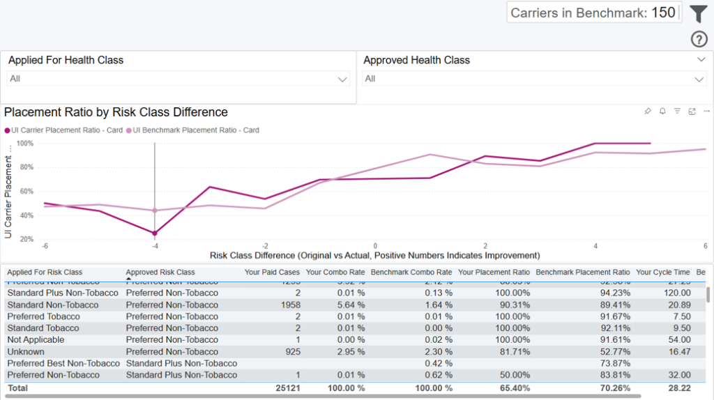
This dashboard allows you to analyze how placement ratios and cycle times vary across different combinations of approved and applied risk classes for both your cases and cases among carriers chosen as the benchmark from the Benchmark Criteria dashboard. The total number of carriers in this benchmark is displayed at the top of the dashboard. As you filter, this number will dynamically update, along with the rest of the dashboard.
*Note: These are only carriers with paid or closed business, so the number may be slightly different than shown on the Benchmark Criteria dashboard, which looks at all business regardless of case status.
The trend lines show how your performance across these four measures compares to the trend of other carriers. You can change the time dimension (i.e. x axis) by selecting the “Week,” “Month,” “Quarter,” “Year” buttons in the top left.
*Note: The benchmark line is the average of all other carriers for placement ratio, and the total of other carriers for case numbers.
Data Definitions
Benchmark = the other carriers you’re being compared to (selected on the Benchmark Criteria dashboard)
Placement Ratio = paid cases / (paid cases + closed cases)
Risk Class Difference = risk classes are sorted from best to worst (this rank is the order that the risk classes appear in filters on this page) – the difference in rank between the approved and applied risk class is the risk class difference. For example, if the Applied For Risk Class of a case is Preferred Best Non-Tobacco and the Approved Risk Class is Standard Non-Tobacco, the Risk Class Difference of that case is -3, because the case was approved for a risk class 3 levels worse than it was applied for.
Filtering the Dashboard
Choose the Filter icon in the top right of the dashboard to narrow down by sub-carrier, product, premium, face amount, health class, and more. Note: At least 4 carriers and 4 agencies must be chosen from the benchmark to show all data on this page. This is in order to protect our customers’ data. If some measures are hidden, choose less restrictive filters and they will reappear.
Some cases with premiums or face amounts outside of realistic bounds had their premiums dropped during cleaning to not skew averages. These cases are not shown by default. To see these cases, adjust the minimum of the premium and face amount sliders to include 0.
Case Details Drilldown
Right click any point on the table and select “Drill through > Drill Case Details” to get your underlying case details.
Exporting Data
Click the “Quick Actions” dropdown in the top right of your screen to send this information to your email. Choosing “Export” will immediately send an email with a file attachment. This email is tied to your InsureSight username.
Choosing “Schedule” will allow you to set up a recurring email to be delivered on the schedule you choose. To modify this schedule, click the “Settings” option in the far-left navigation menu under “InsureSight.”
APS & Paramed Tables
Overview
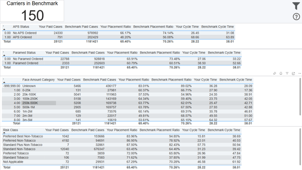
This dashboard allows you to compare certain metrics for your cases versus those for cases from all carriers in the benchmark, by APS Status, Paramed Status, Face Amount Category and Risk class
Data Definitions
Paid Cases = cases where the premium has been paid
Placement Ratio = paid cases / (paid cases + closed cases).
Cycle Time = the number of days from Submission date to Policy Issue date.
Case Details Drilldown
Right click any row on the table and select “Drill through > Drill Case Details” to see all the details for the cases used to calculate the metric.
Exporting Data
Click the “Quick Actions” dropdown in the top right of your screen to send this information to your email. Choosing “Export” will immediately send an email with a file attachment. This email is tied to your InsureSight username.
Choosing “Schedule” will allow you to set up a recurring email to be delivered on the schedule you choose. To modify this schedule, click the “Settings” option in the far-left navigation menu under “InsureSight.”
Case Detail Report
