Mobile/Responsive Design
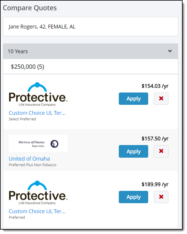
LifePipe uses a responsive user interface that will shift and move to display an optimal user experience based on both the resolution (e.g. height and width) and orientation (e.g. portrait and landscape) of the device. This allows Forms to provide the best possible experience across multiple devices like laptops, tablets, and smartphones.
LifePipe is compatible with Internet Explorer 11, Chrome, and mobile devices, including Android Phone, iPhone 6 (current iOS version), and iPad (current iOS version).
Sample Search Results for Mobile Display


